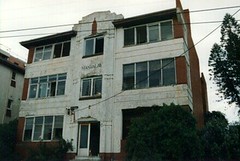
On our visit to Cape Town we hired mini-van and a driver for a trip down the cape, spotting deco and wildlife as we went.
This house was just off the road on the side of a hill and I'm sure we all yelled 'Stop' simultaneously when we caught a glimpse of the colours and that amazing circular room at the front.
I like the red and blue stripes above the large curved window and the port hole near the door, but my favourite part is the eyebrow on the rectangular window on the left of the door which starts above the window and sweeps around to ground level.
Monday, March 30, 2009
Sunday, March 29, 2009
former Scott's Garage, Mandurah
Stop 4 on the City of Mandurah's Foreshore and Inner City Heritage Walk is the former Scott's Garage, a white streamline service station with pink candy stripes.
It was built in 1937 and became the home of The Little Theatre. The theatre has moved to different premises further along the street and when I took this picture, Scott's was For Lease.
Saturday, March 28, 2009
Incinerator Arts Complex, Moonee Ponds
In July 1930, The City of Essendon opened their new municipal incinerator designed by Walter Burley Griffin and his partner Eric Nicholls.
It operated until 1942 and then as a storage depot until 1981 and was then converted into a theatre in 1985.
In 2003 it was voted one of Victoria's best buildings by the Victorian Chapter of the Royal Institute of Architect.
It now houses the Incinerator Arts Complex.
It operated until 1942 and then as a storage depot until 1981 and was then converted into a theatre in 1985.
In 2003 it was voted one of Victoria's best buildings by the Victorian Chapter of the Royal Institute of Architect.
It now houses the Incinerator Arts Complex.
Friday, March 27, 2009
The Hop, Asheville
According to Asheville: A Postcard History by Sue Greenberg and Jan Kahn, this building was originally a Service Station built in 1950.
In 1978 the building became The Hop Ice Cream parlour and by 2005 it had turned to this two-tone purple colour-scheme.
I see that The Hop has since moved to a new location so I wonder what has become of this great little building.
In 1978 the building became The Hop Ice Cream parlour and by 2005 it had turned to this two-tone purple colour-scheme.
I see that The Hop has since moved to a new location so I wonder what has become of this great little building.
Wednesday, March 25, 2009
A Door in Tulsa
I love the simple lines of this door in Tulsa.
It has a musical feel to it with the oval elements that are balanced by the series of three ramrod straight supports on the hinged side.
I wonder what lies behind this stylish door?
It has a musical feel to it with the oval elements that are balanced by the series of three ramrod straight supports on the hinged side.
I wonder what lies behind this stylish door?
Monday, March 23, 2009
Eastern Beach, Geelong
In the 1930s, a number of elements were developed at Geelong's Eastern Beach on Corio Bay in the prevailing art deco style. A kiosk, a changing pavillion and an enclosed semi-circular seabaths were among the elements.
During the later pat of the mid 20th century, this simple, local pleasures lost their appeal and the area fell in disrepair but recent investment in the whole Geelong waterfront area has revitalised the area. So much so that the Geelong City Council website describes the art-deco swimming pool and park complex as the jewell on the waterfront.
Sunday, March 22, 2009
Houses, Silver End
I've previously written about Wolverton in the Essex village of Silver End.
Silver End was built by Francis Henry Crittal to house the workers from his nearby window manufacturing plant. The result is a wonderful series of modernist houses designed by Thomas Tait.
While Wolverton was a more substantial house suitable for one of the managers, this street contains more modest workers houses.
Saturday, March 21, 2009
AIG Building, New York
I read with interest a recent post at the Mindful Walker entitled Wanna Buy an Art Deco Gem? Ask AIG which expands on recent news reports that the troubled international insurance company (and Manchester United shirt sponsor) is considering selling their New York headquarters.
The 66-storey building located at 70 Pine Street near Wall Street is as the title of the article say an Art Deco gem. Originally built for the Cities Service Company it was designed by Clinton & Russell and Holton & George and constructed from 1930-32.
I visited the area one dark day in 2005 although perhaps not as dark as those experienced by Wall Street in more recent times. It did allow me to capture the wonderful lights in the foyer through the windows above the entrance.At street level the building includes such wonderful art deco features including this light fixture.And one of the more interesting features is this 3D model of the entire tower included in the decoration above the doorway.
Friday, March 20, 2009
A House in Port Melbourne
This is quite a spectacular house for Port Melbourne, I think it is quite a spectacular house for anywhere.
It sits on a triangle shaped corner block which immediately sets it apart but also most of this part of Port was built up in the late 1800s, almost certainly before WWI.
Part of the reason why this house dates from after WWI is that is is built on reclaimed land. Land reclaimed from a lagoon which when European settlers arrived in the area teemed with wildlife but within 60 years was a polluted mess and by the late 1920s had been completely filled.
With this house, I like the line of decorative bricks across each gable and on the left as we look at the picture, the bay window next to a window with a curved top, again decorated with brick.
The metalwork on the fence is appropriately deco and very stylish. The pattern is repeated in the metal of the security/fly screen doors under the gabled porch. Even the brick wall has a row of thin dark brown bricks adding a nice simple feature.
Wednesday, March 18, 2009
Vinnies Op Shop, Edithvale
This stylish building in Edithvale is a Vinnies Op Shop. A charity shop operated by the St Vincent de Paul Society. I've always called the St Vinnies but they've gone a step further and dropped the Saint.
I don't know what it was originally but it is good to see in still being used and well maintained.
Update - 19 March 2009
Thanks to a comment by Robin below and an article from the Herald 20 Nov 1940 which he has uncovered, I now know that the building was the Unity Theatre seating 500 and a lodge room built for the Manchester Unity IOOF as alterations and additions to their existing building and designed by architect Robert LePoer Terry. Thanks Robin, you're a star.
Monday, March 16, 2009
A Building in Brussels
I spotted this interesting building over the rooftops from our hotel window while we visited Brussels several years ago.
It is obviously Art Deco with a pair of statues of workers (perhaps) and a series of dramatic cream rendered fins which step back with the upper levels of the building.
I did get another shot from ground level but never got close enough to find out what the building is.
It is obviously Art Deco with a pair of statues of workers (perhaps) and a series of dramatic cream rendered fins which step back with the upper levels of the building.
I did get another shot from ground level but never got close enough to find out what the building is.
Sunday, March 15, 2009
Centennial Milk Bar, Ranfurly
Ranfurly, a town on the south island of New Zealand has reinvented itself in recent years as a centre for rural Art Deco.
It's best Art Deco building is the former Centennial Milk Bar and Refreshment Rooms which now houses a collection of Art Deco objects.
Like Napier, on the north island, Ranfurly hosts an Art Deco weekend each February which attracts so many visitors that the town population receives a 10-fold increase.
Saturday, March 14, 2009
Marine Parade, Napier
When Napier was rebuilt after the 1931 earthquake, The Marine Parade area was developed as an outdoor entertainment area.
The Council Architect, J T Watson designed the New Napier Arch (right) in 1938 as a celebration of the new city. Located opposite the Masonic Hotel and the war memorial it marks the entrance to the Marine Parade Gardens.
Watson also designed the Soundshell which sits in the place where local architect Louis Hay had proposed an ambitious Entertainment Centre that straddled Marine Parade. Peter Shaw & Peter Hallett have reproduced the watercolour rendered drawing of the proposed centre in their wonderful book Art Deco Napier - Styles of the Thirties.The concrete area in front of the shell was once an ice skating rink and the somewhat faded art deco zig-zag design of inlaid concrete that surrounded it can still be seen (at least in 1999 it was still visible).It must have been amazing in the 1930s.
Friday, March 13, 2009
Shakespeare Monument, Tulsa
Woodward Park in Tulsa, OK has a rare Art Deco style monument to English playwright William Shakespeare.
The Tulsa Historical Society credit the design to sculptor Eugene Shonnard and local arts matriarch Adah Robinson.
Otherwise there is very little information concerning this stylish memorial.
The Tulsa Historical Society credit the design to sculptor Eugene Shonnard and local arts matriarch Adah Robinson.
Otherwise there is very little information concerning this stylish memorial.
Wednesday, March 11, 2009
Mandalay, St Kilda
On the Upper Esplanade in St Kilda there are two identical blocks of flats called Mandalay.
By the 1990s they had become very run-down and could quite easily have become a target for demolition. However through community action the flats were saved and now they are wonderful showcase of St Kilda's (and Melbourne's) Art Deco heritage.
The balconies that had been enclosed were opened up. The facade repaired and repainted and the glass in the central doors and windows brought back to their original glory.
A new metal fence was constructed using the patterns from the leadlight windows.
Monday, March 9, 2009
St Mary's Church, South Perth
This white vision is the St Mary the Virgin Anglican Church in South Perth.
According to the history of the church, the Church of England had land in South Perth as early as 1860 but it wasn't until 1895 that a weatherboard church was built south of Perth Water. The original land had been sold ten years earlier and thsi church was established on a block donated by politian and newspaper owner J Winthorp Hackett.Three years later the land was reclaimed by the Government for a zoological garden but the church was given a new block on top of Zoo Hill and built a new wooden church. The parishioners did not like climbing the hill to attend services so the building was moved to a new site and served as St mary's until the late 1920s.
At that time a new block of land was purchased, again on top of a hill, and a the design for a new church was commissioned from architect Herbert Parry. The foundation stone was laid on 3 May 1931.The tower with a representation of Christ on top was added in the late 1960s. I think it works well with the rest of the church building
In 1936 a parish hall was built next door to the church..The concrete front to the hall has three vertical windows with 'St Mary's Hall' incised in the wall above them. The walls are curved with a series of seven speedlines flowing from the windows around into the body of the building.
The hall was extended in 1956 but the concrete front remains unchanged except for a lick of green paint to bring out the recessed lines.
Sunday, March 8, 2009
Carlisle Castle, Durban
OK, I'll admit my inspiration for going to Durban tonight is the Cricket. Ponting and Hughes look very comfortable at Kingsmead and the Test at the moment is going Australia's way.
In fact I've just flicked over to The Saint. It's an old B+W episode from 1964 called Luella. I'm a sucker for the old British ITC shows so I'll stick with Simon for a while. But I digress.
This beautiful apartment block is in the Grey Street precict of Durban, next door toVel-Vet Mansions. It is called Carlisle Castle and while the basic shape of the building is very similar to Vel-Vet, the colouring and decoration is completely different.The building is a yellow-cream colour with rouge-red decoration. Between the second and third floor the is a large geometric panel bearing the name of the building.
An larger, more elaborate panel incorporating diaomonds and other geometric shapes, sits above the third floor windows just below the roofline. Centred in this decorative element is the remants of the supports for a flagpole, now sadly missing.
Above the windows the decoration consists of simple row of squares.
Back at ground level the use of red and black bricks, arranged in diagonal stripes flank the communal doorway.
Saturday, March 7, 2009
Tooting Bec Lido, London
The south London suburb of Tooting Bec has a lido, a huge open-air swimming pool, the largest fresh water pool in England.
The pool was opened in 1906 as a bathing lake and within a few months the South London Swimming Club was formed. The club still uses the lido as its base.
There have been many changes over the years including, I believe, a new entrance so I presume this brick entrance has been replaced.
With the focus on outdoor exercise in the 1920s and 30s the pool adopted the name lido and included a fountain to help oxygenate and circulate the water.
A cafe was also added. I'm not sure if the vertical sundial is original, there may have been a conventional clock there but it certainly is very stylish.
The lido is an oasis in Tooting Bec Common providing a tree lined escape from the hustle and bustle of the London Streets and the colourful doors of the the changing rooms are sure to brighten any day.
Friday, March 6, 2009
Chatham Apartments, Miami South Beach
Chatham Apartments is another fantastic deco building in Miami South Beach.
The standout feature is the vertical fin on the front of the building bearing the Chatham Apts name and I love the way Apartments has been abbreviated to Apts. The fin stretches high above the roofline with a flagpole on top and appears to require extra support from a element which I would describe as a double surfboard loggia as it is similar to the example on the Avram Villa in Asmara.
The shade eyebrows over the windows are interesting. Some are squared off while others on the cental section are curved.
The building is white with blue highlights including the three speedlines around the top of the facade.
There is also interesting decoration either side of the fin just above the entrance. These rectangular boxes are actually air conditioners which have been disguised to work with the Art Deco architecture.
At the front of the property there is a lovely low concrete fence constructed of interlocking semi-circles.
The building is curved on the ends and understandably the eyebrows are also curved.
The air conditioning units stand out a bit more on the corner but it is still a very elegant solution to one of necessities for Florida living.
Wednesday, March 4, 2009
Flats, Brunswick
I love this substantial block of flats on a busy corner site in Brunswick.
The red brick contrasts nicely with the yellow render around the windows. Contrast is also provided by the use of cream bricks as a cap around the top of the chimneys and along the upper edge of the central tower.
That central tower above the entrance is constructed as a rectangle with curved sections set back on each side.A thin vertical window provides natural light for the interior of the tower and the simple leadlight pattern almost has an Art Nouveau feel to it.
Above this window a geometric pattern has been created by a thin vertical strip of rendered concrete with tiles or thin bricks set at an angle into the surface of the wall to create protruding triangle shapes. Not quite the rule of three but with seven elements the pattern still employs an odd number.
Monday, March 2, 2009
Flats, Vredehoek
Usually I go out of my way to avoid getting people in the way of the buildings I am photographing. Sometimes there is no way around it.
This a tour group the Cape Town suburb of Vredhoek during the 7th World Congress on Art Deco grabbing what little shade there was out of the South African sun.
This picture also goes a long to explaining why I am a bit hazy about some of the buildings I have photographed. The tour guide is in the right of this photo and as you can see I am on the other site of the road photographing the wrong building and can't hear a word of what he is saying.
Anyone in Cape Town or elsewhere who knows what this building is called, it would be greatly appreciated.
Sunday, March 1, 2009
Montreux Flats, Cape Town
This morning I tagged along for the encore Port Melbourne Art Deco walk repeated because the original walk two weeks ago had been so popular. It was part of the City of Port Phillip Walks Program and you may feel it is a long way from Cape Town. Frankly you'd be correct.
However, one of the walkers was originally from South Africa and remembered a particular block of flats in Queen Victoria Street in Cape Town with wonderful rounded balconies. I had been to the 7th World Congress on Art Deco in Cape Town in 2003 but I couldn't recall the flats she was referring to until Robin Grow, President of the Art Deco and Modernism Society and leader of the walk remembered a block of flats near the Gardens in downtown Cape Town.
The Company Gardens in Cape Town have an interesting history as I have found out from an article by Stewart Harris in the 7th Edition of the Vernacular Architecture Society of South Africa (VASSA) entitled How the garden grew: A brief spatial history of the Cape Town Gardens.
The gardens were founded in the 1650s by the Dutch East India Company and changed shape and purpose through successive Governments and the encroaching city to become the gardens of today.
The passage in Stewart's article which drew my attention concerned the development of Queen Victoria Street, bordering the gardens, which in the late 1920s and 1930s acquired more grand buildings including a block of flats called Montreux in 1936.
Now back to 2003 the Congress included a visit to Montreux to view a flat that had been furnished with locally produced pieces.
The furniture was fantastic but so was the metalwork on the stairways and internal balconies overlooking the central courtyard.Not to mention the internal wooden doors with small diamond shaped windows and stepped vertical patterns both on the door panel and the surrounds.I have no idea how I could have forgotten this wonderful block of flats.