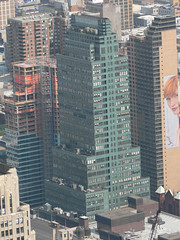
 New York City is rich with Art Deco skyscrapers and the McGraw-Hill building in West 42nd Street is a beauty.
McGraw-Hill moved out in the 1970s and their name which was in a striking deco font was removed from above the door. McGraw-Hill is still on top of the building although it is somewhat compromised by the air-conditioner units sitting right next to it. There are three units on each side of the building so I guess they keep the symmetrical deco styling.
I quite like my photo taken from the Empire State Building (click on it to view a larger version). The green giant really stands out against the less colourful surrounding buildings. 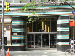 But if you want to see colour, you just need to look at the entrance on 42nd Street. Bold aqua and gold bands set in a black surround. Sounds a bit much when you read it but look at the result in the picture. Stunning! The curved wall of the entrance work with the banding to draw you into the building.
The McGraw-Hill building may not be up there with the Theatres of 42nd Street but it is worth dragging yourself away from the bright lights of Times Square to venture across 8th Avenue, past the Port Authority Bus Terminal to check it out.
Wednesday, April 2, 2008
McGraw-Hill Building, New York

Monday, March 31, 2008
Abbey Hotel, Miami South Beach
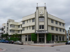 The Abbey Hotel, in Miami’s famed South Beach Art Deco precinct, was built in 1940 to plans by architect Albert Anis.
The hotel occipies a corner site with the main door set right on the corner. The name of the hotel is spelt out right above the door. Further up, the roofline features two barber’s poles.
The building itself is quite plain with the windows set-back creating strong horizontal banding between each row of windows. The ground floor is coloured darker than the upper two storeys of the hotel perhaps to distinguish between the public and private spaces within the building. 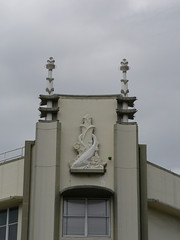 There is a deco panel along the side of the hotel at street level featuring a nice representation of a stork.
The crowning glory of the Abbey Hotel, however, is the relief of the Salamander on the front of the building above the door.
Now you don’t often see a Salamander as decoration on a building but then nothing would surprise me in Miami South Beach.
Sunday, March 30, 2008
Carreras Cigarette Factory, London
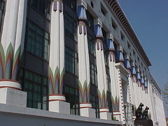 This Egyptian temple was built in 1926-28 by architects M.E and O.H Collins with A.G Porri just a few years after Howard Carter had discovered the intact tomb of the boy-king Tutankhamun. Originally Carreras Cigarette Factory it became an office building in the 1960s losing many of the wonderful Art Deco features.
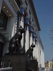 Egyptian inspired Art Deco at its most colourful and those colours are amazing. Blue, red and green at the top and bottom of each column emphasising the lotus flower a common ancient Egyptian design motif.
The entrance is guarded by a pair of black cats. These statues stand over a metre tall at the top of a short flights of steps leading up to a modern glass doorway.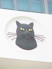 The black cat was the logo of Carreras Cigarettes and is also represented in a series of reliefs along the façade of the building either side of the Carreras name. Seen close up, the reliefs show a cats head with bright yellow eyes and wire whiskers.
Now called Greater London House the building was restored in 1999.
Saturday, March 29, 2008
Old Deco Advertisment, Talbot
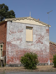 I found this old Art Deco ad as we detoured off the main road to check out the town of Talbot in goldfields of Central Victoria.
You can just make out that is for Henderson’s which I guess was a garage of motor car sales room. I could be completely off the mark and I’d love to find a similar advert in a newspaper to find out more about Henderson’s.
The ad says stop that galloping and a picture of a 1920s car with perhaps a plane flying over it. If you look carefully there is an even older ad painted underneath this one. You can just make out a larger version of the car covering the front part of the small car and stretching up towards the plane. There is also some very faint writing at the top of the ad but I can’t make it out.
I like to think this is a true Art Deco that has survived into the 21st Century and just shows you that sometimes you need to step of the well beaten path to find something interesting.
Friday, March 28, 2008
Ararat Town Entry Signage
 The Ararat Advertiser reported on 25 Mar 2008 that the Ararat Rural City Council had adopted a new design for signage on the main road entrances to the town.
The design incorporates details from Ararat's Art Deco buildings in front of a Mount Langi Ghiran backdrop. It already features on flags in some of the town's roundabouts and three dimensional installations of the new design will be located at each of the five main entry points to the town.
Ararat is a former gold-mining town located in rural Victoria on the Western Highway and is recognised as the Gateway to the Grampians.
The Advertiser article reports that several Councillors did not like the new design and one even said it left her cold.
I love it. The colours are subtle and it uses town Art Deco assets to provide unique branding for the town. The concept of Rural Deco has become quite popular in recent years with the concept most notably at Innisfail in Queensland and Ranfurly on the South Island of New Zealand.
Congratulations to Ararat Rural City Council I look forward to visiting the town in the next few weeks and see their Art Deco buildings for myself.
Wednesday, March 26, 2008
Bar Zilli, Asmara
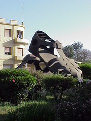 In the middle of a roundabout on Martyrs Avenue, Asmara is a large sculpure of a pair of sandals dedicated to the Eritrean Freedom Fighters who wore these types of shoes during their long struggle against the Ethiopian occupation.
Bar Zilli, nearby, looks like a ship sailing right into the middle of the intersection, complete with a row five of porthole windows down each side. While the front could be an oversized Art Deco radio, complete with heart-shaped antenna.
Bar Zilli’s radio-style façade curves around the corner and is dominated by a 6x6 grid of windows although two rows have been blanked out. Above the grid, two deep horizontal lines have been cut into the concrete filling the space to the roofline. The only other features on the front of the building are two sets of horizontal windows arranged in bands of three similar to the decoration on the Capitol Cinema also in Asmara. 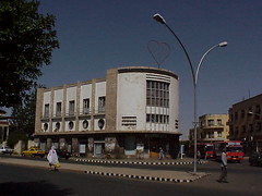 As mentioned previously, each side of the building has a row of five porthole windows. Each porthole has a more traditional window above it and is separated from its neighbour by a rounded marble column.
The heart on top is an advertisement. Sorry I can’t tell you what it is for because it is written in the local Tigrinya language.
Reference:
Asmara: Africa's Secret Modernist City
Monday, March 24, 2008
Masonic Hotel, Napier
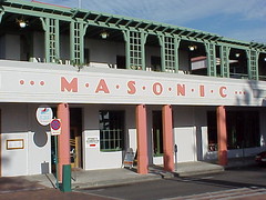 I was flicking around the Foxtel sports channels this morning and noticed that the 3rd Test, New Zealand v England is currently being played at McLean Park, Napier, so I thought I'd write about the Masonic Hotel on Marine Parade.
The hotel was built in 1932 to plans by Wellington architect WJ Prouse. It is a long two storey building with a simple wooden pergola on the overhanging balcony. The name Masonic spelt out in a typically deco font.
Around the corner is a side entrance marked with a large piece of geometric decoration at the roofline and a glass canopy sheltering the doorway with Masonic spelt out in a joined series of stepped leadlight windows. A few years ago a delivery truck damaged the canopy but I believe it has been repaired.
The Masonic's website (it is easy enough to find in your favourite search engine) proclaims Napier's Largest Original Art Deco Hotel and there is a certain deco feel to the website but otherwise I found it very disappointing. There are no photos of the building or details of its history.
The Napier Art Deco Trust site on the other hand has a photo of the hotel on their home page but the hotel doesn't even have a link back to them.
The Masonic Hotel is a great building, a landmark building and a good place for a beverage after a hot day at the cricket or a sightseeing in New Zealand's Art Deco city of Napier.
Sunday, March 23, 2008
Osterley Tube Station, London
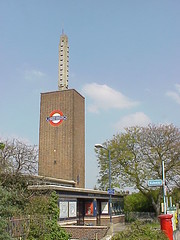 Charles Holden was a British architect who designed many of London’s Underground Stations dating from the 1920s and 30s. Osterley Station, which he designed to replace and earlier station located nearby, opened in 1934.
The station is dominated by a tall rectangular brick tower displaying the familiar London Underground logo. This brick tower is topped with a concrete pylon with white square lights set into each side.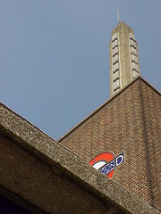 The rough 'pebble-dash' concrete contrasts nicely to the smoothness of the small brown bricks of the main tower.
Osterley is on the Piccadilly line, out towards Heathrow. If you have the time, it is worth getting off at each station and having a look around especially at these outer stations which despite being part of the London Underground are usually above ground and are more likely to be purpose built stations.
This is one of my favourite shots of Osterley Station. I think the way the geometric shapes and lines of Holden’s design creates a dramatic image, even if the Underground sign is half obscured.





.jpg)


