This is the main entrance to the 1932 Hoover Building by Wallis, Gilbert and Partners. The doorway is dominated by an amazing decorative feature two storeys high incorporating two separate of clear glazed panels.

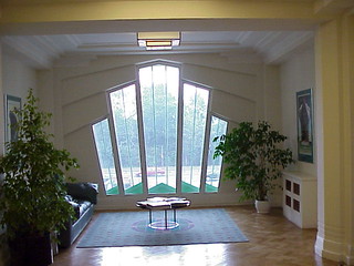
And the windows are just as stunning from the inside.

 MELBOURNE ART DECO
I know the Hoover Building but only from passing by in a slow car. But the main entrance deserves to be examined more closely *nod*. The clear glazed panels are well above the door, and they in turn are surrounded by strongly coloured tiles? paint?
ReplyDeleteJust the black wrought iron work at door level seems a bit over the top.
They are tiles Helen as are the decorative curls on other parts of the building. I don't know if the wrought iron gates at the door are original or a later addition for added security. From memory they are similar to the front metal gates of the property.
DeleteI love it from the inside.
ReplyDeleteI agree, the arrangement of shapes works really well.
Delete