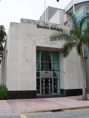
 The former Chase Federal Savings Loan Association building in Miami South Beach has been turned into a Banana Republic clothing store.
It is a great example of the reuse of an existing building when it is not longer required for its original purpose.
The original relief work on the front of the building above the entrance remains. It depicts 'FC' inside a disc bearing the words "Chase Federal Savings Loan Association" with two stylised eagles, one on either side.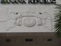 The updated signage for Banana Republic is above the carvings and therefore does not interfere with it.
Inside, some of the old desks are not used as counters and the large safe has been converted to a changing room. It is great to see the masive round door still in situ.
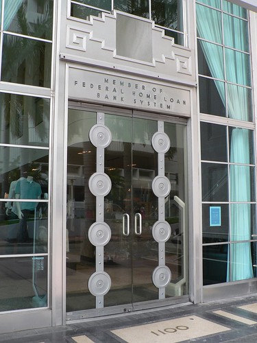
The front door is also well done. A mass of metal and glass, it still conveys an impression of a bank but allows a modern clothes retailler to show off their designs and entice customers into the store.
Sunday, November 30, 2008
Banana Republic, Miami South Beach
Saturday, November 29, 2008
A House in Port Melbourne
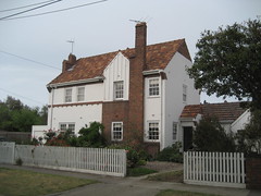 Dunstan Estate in Port Melbourne is the smallest of three residential estates built in the area during the interwar period. It mostly consists of two-storey semi-detatched white houses with red brick features. They are quite English in style and not that common in Australia.
Inside they have some nice built-in wooden features including the bannisters and the cupboards under the stairs.
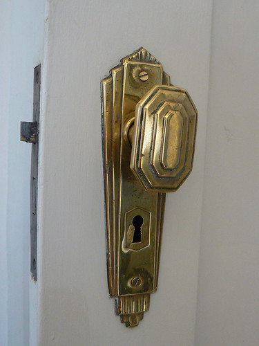
The interior door handles are pure deco and seem to vary slightly from house to house (I've only been inside two so admittedly it is a small sample).
Friday, November 28, 2008
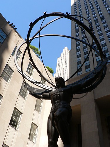
Atlas, Rockefeller Center, New York
It is one of 12 works by Lawrie in the Center and it was chosen the Art Deco Society of New York for the poster to promote the 8th World Congress on Art Deco which they hosted in May 2005.
Wednesday, November 26, 2008
EK Building, Hastings
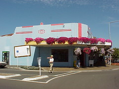 While Napier has claimed the title of "Art Deco City", nearby Hastings highlights it stock of Spanish Mission buildings. Hastings, however has it's share of deco, including this shop on a city centre corner.
The building has been flatten across the corner to provide a doorway with simple stepped decoration above. 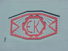 I've called it the EK Building because those initials are incorporated into a panel on the side of the shop above the verandah. This panel is very decorative compared to the rest of the building where, in the main, the decoration consists of horizontal lines and simple decoration cut into the top of the wall.
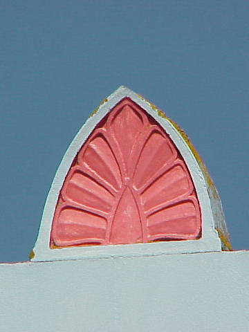
The other decorative item is this stylised floral element sitting up roofline.
Monday, November 24, 2008
Wolverton, Silver End
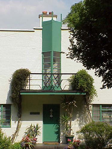
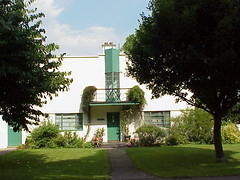 In 1926, Window manufacturer Francis Henry Crittal established a works near Braintree in Essex and created the village of Silver End to house his workers.
The result was a wonderful collection of Modernist houses designed by Thomas Tait with metal Crittal windows.
This is Wolverton which is probably one of the best houses in the village and would have been for one of the managers at the Crittal plant. Workers had more modest houses in nearby streets.
Sunday, November 23, 2008
Last Stop Bedding & Furniture, Maryborough
 I find the paint job on the Last Stop Bedding & Furniture store in Maryborough interesting.
I like the way it highlights the decorative elements of the building but it has gone a bit wrong with the columns on each side of the taller central section. I suspect the windows and door have been altered to accommodate the requirements of the furniture store meaning that the right-hand column has been truncated above the door.
In addition the name of the shop necessitates the brown colour stopping above the writing. However the brown on the other column, which reaches to the ground, stops level with the bottom of the store name. The result isn't unpleasant and it could be argued that this is a creative solution to a design problem. There are no such issues at the back of the store where a different style facade has been tied into the High Street entrance with the addition of two painted brown columns that also complement the subtly stepped pediment.
I think it is great that Last Stop Bedding & Furniture have linked two or more shops to provide a homogeneous style using the underlying style of the architecture without detracting from it.
Saturday, November 22, 2008
Kylemore, Dalkeith
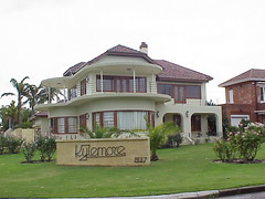 This magnificent house on a large corner block in the Perth suburb of Dalkieth dates from 1937.
I like the circular rooms on the ground floor which are mirrored in the second storey balconies.
Even the railing around the balconies seem to match the proportions of the panes in the smaller curved windows below.
Most of all, I like the fact that the property has no fencing so we can enjoy the full beauty of the building.
Friday, November 21, 2008
Mayfels Restaurant, Asheville
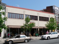 Mayfels restaurant occupies this building in Asheville. A plain building, at first glance, with simple decoration above fluted columns. However, the tiles above the windows carry a wealth of subtle detail.
The first row of tiles feature chevrons, the second row ziggauraut forms.
The column capitals consist of an arrangement of geometric shapes and an element which could be in the form of a feature.
I like the way the pattern emerges from the facade when light hits the ridges on the tiles. No need for complicated colour schemes.
Wednesday, November 19, 2008
Royal Historical Society of Victoria, Melbourne
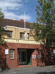 I had the pleasure of attending a workshop at the Royal Historical Society of Victoria (RHSV) today. The RHSV occupy this fabulous late 1930's building in Melbourne.
Originally, the building was constructed for the Army Medical Corp and their name and insignia appear above the door leading off A'Beckett Street.
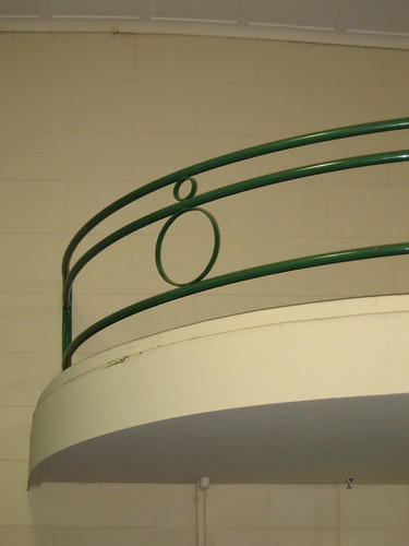
The main room used by the RHSV is located on the ground floor with a mezzanine work area along the length of one wall. At each end, ther is a curved section with a simple design of two circles worked into the ballustrade.
Monday, November 17, 2008
Theatre Royal, Castlemaine
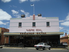 Around 1852, a rough timber and canvas structure housing auction rooms and a theatre/assembly rooms was contructed in the Victorian town of Castlemaine. It served the rapidly growing population of diggers who flocked to the area when gold was discovered throughout the region.
In 1856, a local newspaper, the Mount Alexander Mail reported that a hotel (Royal Hotel) would be etsablished in the rebuild front portion of the building while the rear would be remodelled into an elegant theatre (Theatre Royal) which could also be converted into a ballroom.
It didn't last long as in November 1857 a fire destroyed both establishments. A new stone and brick building with an iron roof was soon constructed and that building is fundamentally what we see at the Theatre Royal today.
Of course it has changed since then. It was remodelled in deco style in 1938 giving the old theatre a modern look.
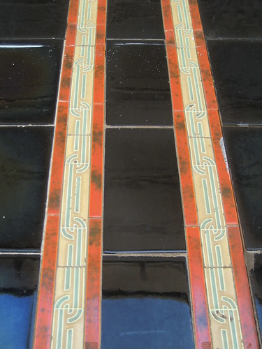
A decorated roofline with a simple stepped pediment in the centre. If you get a chance to see the building up close, it has black tiles around the doors with two lines of decorated yellow and green tiles with a thin border of orange tiles.
The Theatre Royal is the oldest continually operating theatre on the Australian mainland and I reccommend you check it out if you are in Castlemaine even if you only have time for a coffee at the cafe in the foyer.
If you have more time they also offer bed & breakfast accommodation back stage in the theatre that includes free Theatre Royal movies. How good is that!
Theatre Royal, Castlemaine website
Sunday, November 16, 2008
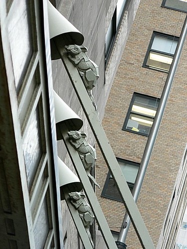
Rats, New York
Or at least from getting into the company.
Saturday, November 15, 2008
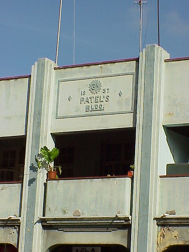
Patel's Building, Durban
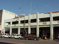 The Grey Street Precinct of Durban is a bustling commercial with a thriving Indian population. During the interwar period building in the area peaked and many of the local Indian businessmen built premises and naturally put their names on the front. In Durban they call this style Afro-Asian Deco.
Patel's Building dates from 1937. Like many buildings in the area it has an open balcony area on the second storey providing a shaded verandah in front of the shops and businesses at street level. The upper level is supported by 8 columns with simple stepped capitals.
The central two columns are the tallest reaching just above the highest point in the stepped parapet which partly conceals the conventional hip roof behind.
An open latice section on the fron of each section of the balcony provides additional ventilation and simple decoration.
A simple two-tone blue colour scheme highlights the decoration on the columns while the parapet is topped by a rust coloured capping.
Friday, November 14, 2008
Music Hall Tavern, Blackpool
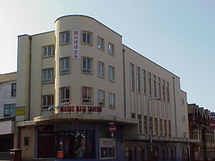 This is an interesting building in the seaside English town of Blackpool.
These photos were taken in 2001 when it was called the Music Hall Tavern but also bore signage on the upper floors reading Buddy's.
I think it is interesting because of the curved front and entrance with the rest of the building taking on a more standard rectangular form with stepping in both the roofline and the marquee.
www.JoeLongthorneFans.com lists that in 2001 singer Joe Longthorne is signed to "Ritz Music Group" and becomes inovlved [sic] in his own club "Joe Longthornes Music Hall Tavern", however the venture is short lived oweing [sic] to yet more financial strife.
From the For Sale sign on the building, I wonder if this picture has caught that moment in time.
Wednesday, November 12, 2008
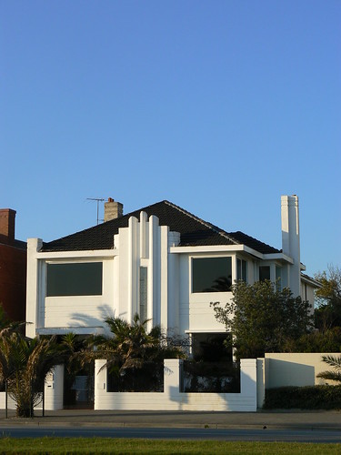
A House in Middle Park
In any case it is an interesting building. Asymmetrical with the way it is set back on the right hand side with the windows also cutting into the corner on the same side.
The dominant feature, though, is the central element which lifts this building above an ordinary residence.
Monday, November 10, 2008
A house in Ararat
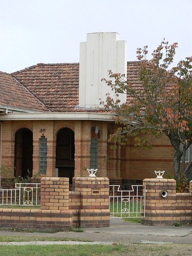
 A first look this house in Ararat is a fairly conventional house with a pitched roof but the closer you look the more details emerge.
Firstly, the low wall around the property is constructed of several different coloured bricks. The house itself introduces a couple of other brick colours aswell.
Each of the windows is cut into the corners of the house.
The porch at the front door uses glass bricks to interesting effect, highlighting the stepped decoration between the brick pillars.
And then we have the chimneys. Rendered white slabs against the creams of the bricks of the house and the tiles of the roof. Stepped higher and wider in the centre compared to each side, a design echoed in the three vertical lines on the front of each chimney.
Sunday, November 9, 2008
Commonwealth Edison Substation, Chicago
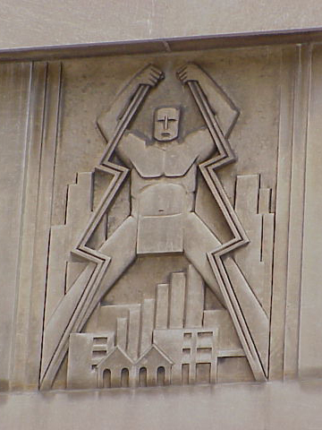
The relief shows a male figure staddling a city while he directs a pair of lightning bolts to provide power to the buildings below.
Saturday, November 8, 2008
Ranfurly Auto, Ranfurly
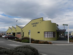 I love the lines of this building in Ranfurly on New Zealand's South Island.
The sawtooth roof of the workshops on the left is mirrored somewhat with the stepped down roofline of the front office on the rounded corner of the building with the large segmented window.
A very handsome building and a great example of rural New Zealand deco.
Friday, November 7, 2008
Cohan's Villa, Asmara
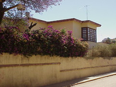 Asmara has a number of villas built before WWII in a variety of deco styles.
Cohan's Villa, according to Lonely Planet, was built in the 1930s for a prominent Jewish trading family.
To me the standout feature is the blue tinted windows that wrap around the corners of the building.
I also like the line in the wall which is set a different levels. I don't know if it was designed this way or if the wall has been leveled at it's current height.
Reference:
Lonely Planet, Ethiopia, Eritrea & Djibouti ~ Frances Lindsay Gordon, 1st Ed, November 2000
Wednesday, November 5, 2008
Windsor Flats, Vredehoek
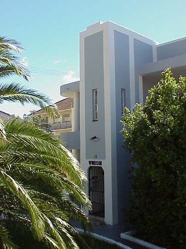
 Windsor is another block of flats in the Cape Town suburb of Vredehoek on the lower slopes of Table Mountain.
The building is symetrical around a central tower with a short stepped element at the roofline. The rest of the block with is set back from the tower also has a shallow step which is emphasised by the white line painted near the top of the facade against the blue-grey of the rest of the building.
The corners and structural elements of the tower are painted white providing a simple pattern.
At ground level, there is a simple communal entrance with the name, Windsor inscribed on the wall above it.
The upper floor flats at the front of the building have open balconies with a curved shelter supported by a thick round column again painted white.
The white theme is continued in the garden with the raised border of the path leading to the front door.
Monday, November 3, 2008
A House in Bendigo
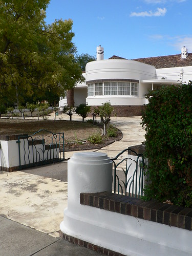
 This fabulous house is in Bendigo.
It has so much going for it including the well-maintained garden.
The low stepped wall around the large corner block is gorgeous, mixing raw brick with white-painted render. Look at the gateposts. Bulky cylinders but in porportion to the wall.
The gates could be in the form of stylised plants.
The house itself has two circular rooms at right angles to each other. A wonderful porch has been been created where they meet.
The chimney at the front of the house is tall and striking, rendered white except for the rule of three brick lines near the top.
Another house I could live in ... dream on.
Sunday, November 2, 2008
Flats, Ballarat
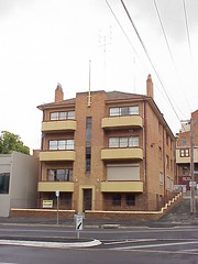 I love the wall that runs down the side of this block of flats in Ballarat. The three storey block is cut into a hill so the wall which runs alongside the footpath needs to step down from the back of the property to the street running along the front.
Otherwise the building is symetrical around a central tower topped with a flagpole. Each flat at the front has a small rounded balcony.
It's a shame the flat at the bottom right has installed a shutter which is completely out of character with the rest of the building.
Saturday, November 1, 2008
Deco Plaques, Tulsa
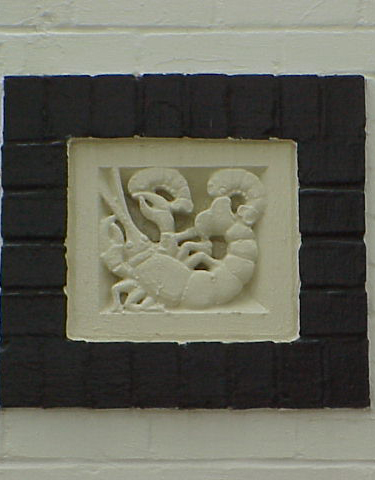
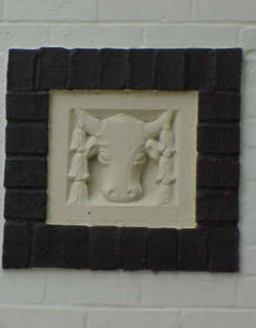
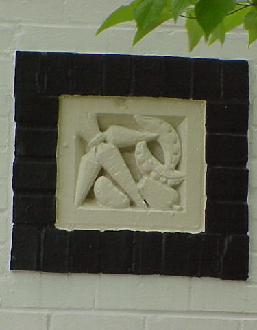
Here is a collection of plaques from a building in Tulsa. Either the building is not that interesting or I am an idiot, possibly both. In any case I don't have a photo of the building as a whole so I don't know what it is or even where, in Tulsa, it is. I suspect it is a market building and these are the products for sale.







.jpg)


